Week #4 - Layout/Poster
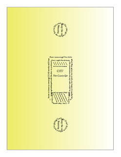
The first poster that I finished, and the one that I am most proud of, is for the Arcade Fire song "No Cars Go." I had some difficulty getting the silhouetted outline to work so I designed the shapes manually. I think the simplicity looks the most elegant here and contributes to the overall aesthetic of the design. The yellow is meant to tie in with the idea of turning the lights on/off (subtle, I know).
The second poster goes with the same band's song, "Sprawl II (Mountains Beyond Mountains)." Some of the angles on the "shadows" are inconsistent, which I think detracts from the design, especially when viewed up-close. The main lines of the string are the strongest aspect, in my opinion. As far as inspiration goes, the red came from the stop light/sign imagery used throughout the album, and the idea for the swing came from the youth-evoking lyric about kissing beneath the swing set in the song.
The final poster that I designed accompanies the song "Wake Up," from Arcade Fire's debut album. This is by far the weakest design in the trio. The shapes are the most complicated and designing them by hand did not go nearly as well as I would have wanted. The frame went rather nicely but elements such as the pillows and blanket act more as distracting clutter than as truthful parts of the design.
I have included my three sketches below.

I have been reading a collection of Anton Chekhov's plays lately, so I chose to look at its design. I chose this specific page because it is bit busier than many of the other pages in this play (The Seagull) - there is dialogue from many characters, some entrances, and stage directions. The layout (margins, etc.) is spacious, so as to draw attention to the text of the play. It is compact, but not excessive. The typeface is very formal and straightforward. It is a fairly small size, which is fitting. Since it is a textual adaption, it is intended for reading, instead of for the study and notation that would go with the original scriptural version meant for performance. There is no index. The colophon is neat and simple.


Some solid process steps explored.
ReplyDelete