Posts

Week 7 & 8

Image
Time constraints are quite the nightmare. I have long known this, but it always becomes especially apparent when I am faced with something that I want to spend substantial time yet don't have the time to do so. Additionally, I have realized that, at least in the fleeting moment, my creativity does not tend towards the layout side of things. Reviewing some of the truly exceptional example designs for the book design project has made this at least partially clear. Combine the above factors and you get a slight hint of disappointment. Justifying lack of effort as anything other than a lack of effort (for whatever reason) always amuses me, whether in response to my own weak attempts or to those of others. My favorite moments are when something poignant or astounding comes out of someone essentially improvising fake reasons for why a creative choice was made. In the case of these books, a substantial number (if not all) of my design choices were made in the interest of completion...

Week #6 - Resume

Image
My prior resume is quite colorless. Part of that is due to the attempted minimalism of the overall design, though I realize in retrospect that a lack of color and a simple, sleek design are not mutually exclusive. It is also because this resume was created for Business Communication, a course that emphasized uniformity, formality, and straightforwardness, to say the least. This played a part in the uneventful design choices compiled here. My main goal for a new and aesthetically updated resume created with InDesign will be to keep the structured and central design of the text while adding tasteful flavor and uniqueness (hopefully without going overboard). If I am not able to find a satisfactory way to meld the two approaches to resume layout, I may keep the above resume in some form in order to utilize it for much more formal job or internship applications. I would then reserve the more creative design for circumstances in which it would work better. Ideally, that will not be nece...

Week #5 - Spread

Image
For my investigation into page layout, I selected this spread from September 2011 issue of WIRED  magazine. The page size is typical of most magazines: 8 3/8 x 10 7/8. The visuals on the pages are proportionately larger than the text, although there is still a notable amount of text. Clearly, the worlds of both text and visuals meet in a very significant way, with the large "Lost:" at the top. The margins are almost deliberately minimized. They are often filled with black filling, or an image goes to the very edge of the page, eliminating any real margins. The only gutters present on the page are located in the bottom right corner. Even then, those gutters are marked up with gray lines and even an image. The strongest headings are "Deleted Doctor Who " and "The definitive guide to pop culture's buried treasure." Both of those are likely around a 28-36 pt. font size. The "Doctor Who" could be an Arial Bold font. What appears to be Courier...

Week #4 - Layout/Poster

Image
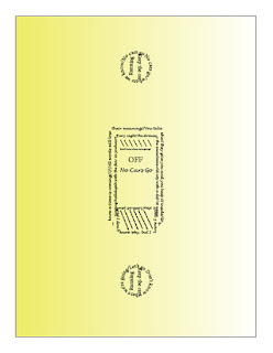
The first poster that I finished, and the one that I am most proud of, is for the Arcade Fire song "No Cars Go." I had some difficulty getting the silhouetted outline to work so I designed the shapes manually. I think the simplicity looks the most elegant here and contributes to the overall aesthetic of the design. The yellow is meant to tie in with the idea of turning the lights on/off (subtle, I know). The second poster goes with the same band's song, "Sprawl II (Mountains Beyond Mountains)." Some of the angles on the "shadows" are inconsistent, which I think detracts from the design, especially when viewed up-close. The main lines of the string are the strongest aspect, in my opinion. As far as inspiration goes, the red came from the stop light/sign imagery used throughout the album, and the idea for the swing came from the youth-evoking lyric about kissing beneath the swing set in the song. The final poster that I des...

Entry #3 - Lettform

Image
As stated in my previous entry, I decided to construct the letter 'P' in the Acier BAT Noir font. What interested me most about using this specific font was the idea of hollowness. In the digital typographic representation, the main stem of the letter is solid white, but appears somewhat hollow. With this negative space, I was able to utilize light in unique ways while setting in its natural environment. The body of the letter was made entirely of cardboard and connected with hot glue. I cut out eight separate pieces of cardboard to create a fully three-dimensional representation. Originally, I was planning on painting the stem white and the curve black, but I found a light blue paint that I think worked much better and added an interesting element, especially when set against the sky. My primary "triumph," so to speak, with this project was its relative minimalism. The simplistic construction process still managed to allow for some creative approa...

Entry #2

Image
For my typeface design, I have decided to use the Acier BAT Noir font . I will be crafting the letter P (it will not be as grainy and low-resolution once constructed, of course). Right now, my plan is construct the base out of cardboard and make the stem of the P hollow. I am also planning on experimenting with different colors of paint. The joints will be constructed with gaff tape and glue. Depending on the paint color, I am intending on photographing my design in a window, so as to highlight the hollowness and potential contrast of light and dark.